Why'd you choose that Picasso?
Unsurprisingly, the question I get most often about my project is “How do you know which artwork to match with the photograph?” I’ve tried to distill my answer down to a few sentences that fit neatly into an Instagram comment, but those answers never felt particularly genuine — they were surface level explanations of art history as a discipline and lacked the nuances of the association process. So I’ve decided to walk through a recent match I made with Pablo Picasso, to illustrate generally what goes through my mind as I encounter fashion pieces.
To set expectations: the act of identifying crossovers between fashion and art movements is not a radical one. Projects such as mine have existed for decades — in books, magazine articles, critical essays, collages, college theses and in recent years, social media. In no way do I claim my process unique — quite simply, it mimics the strategy I learned in college, when a professor would put up an artwork we've never seen and challenge us to identify the provenance, year and artist. Art history students will recognize this association exercise well.
When viewing a fashion snapshot, it takes about two seconds to determine whether I have the capability to quickly match the piece to an artwork — for the most part, I don't conjure an artwork within a second, but whether I experience even a modicum of “Aha!” determines if I should pursue it. It’s kind of like answering a trivia question before the question is even finished — you’ve recognized just enough information to piece together what comes next. After a few years of practice, this becomes pretty reflexive.
From a high level, this is how it works:
- Encounter a fashion shot.
- Describe the image. Unpack the colors, the composition, the body language, the setting. Do you spot any motifs or symbols? See if those translate into a pictorial vocabulary that may resonate with an era or movement. Sometimes you may identify multiple potential influences.
- Research and narrow down artists from said era/movement.
- Find a few artworks and use your description to determine the best pick.
Picasso’s influence as an example
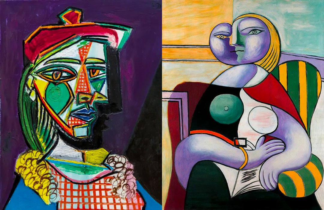
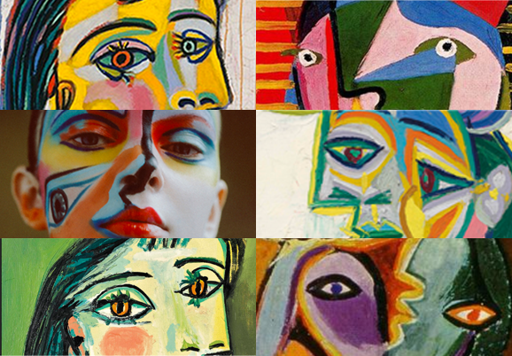
I’ve chosen to illustrate this process with Pablo Picasso due to his prolific and astoundingly varied oeuvre. Many people will recognize the influence of the famed artist most notable for Cubism. His works have been referenced time and time again in fashion, but exactly which pieces are referenced can be quite tricky. After all, let’s look at a handful of works:
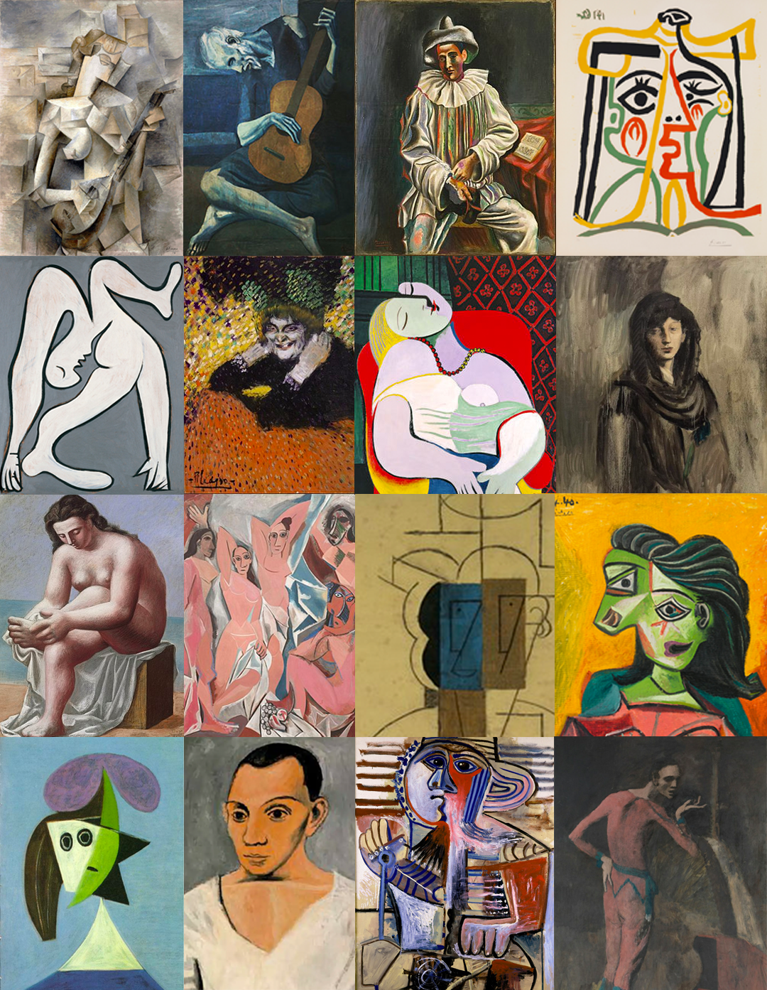
Works cited at the end of the post
It’s incredibly diverse. But even a passing knowledge of Picasso’s eras can help narrow down where we should focus our research efforts on.
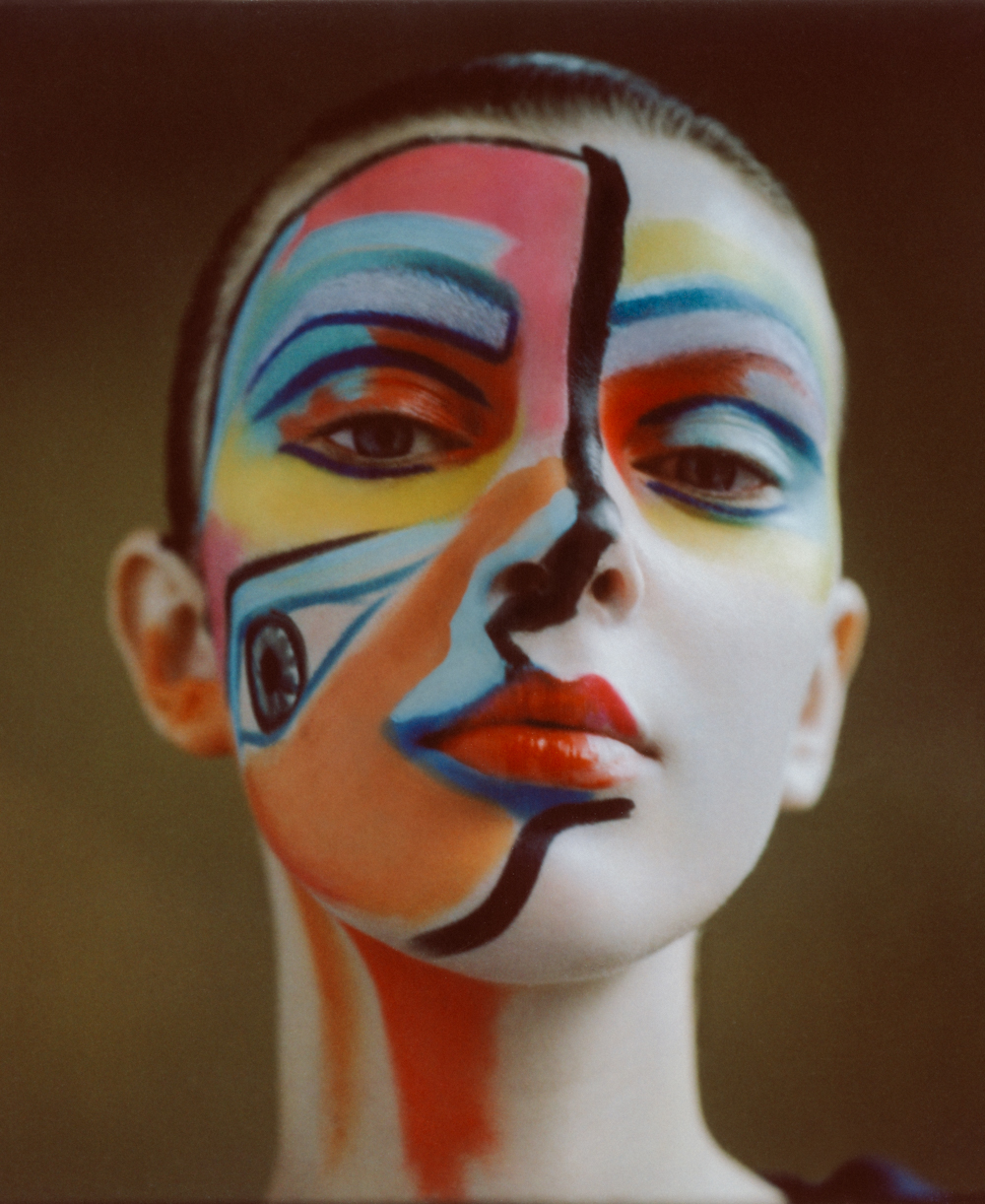
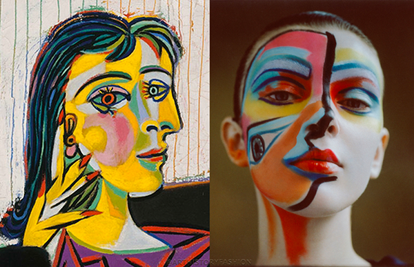
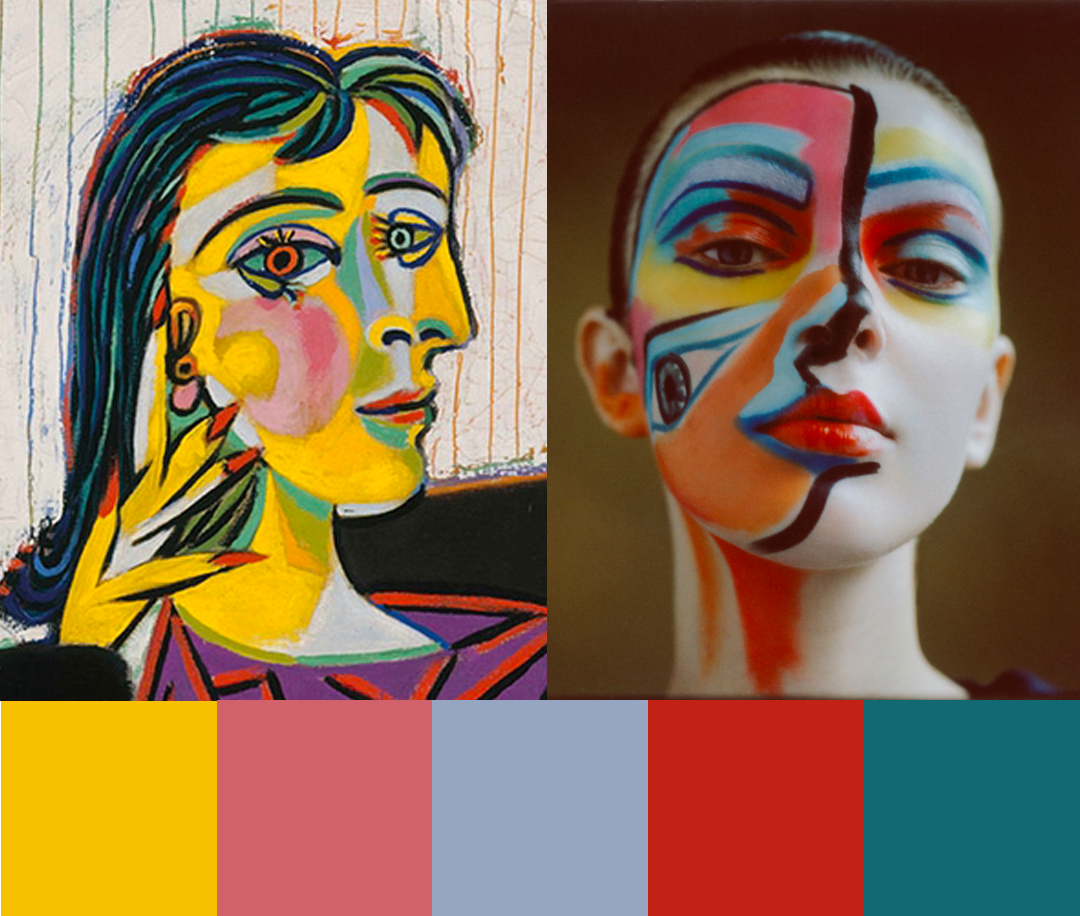
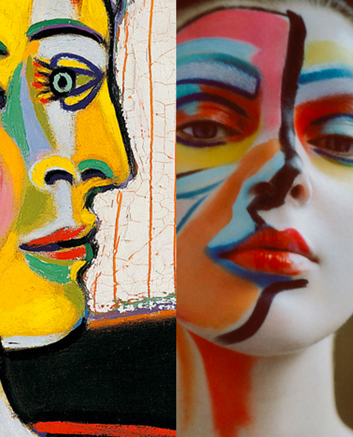
Photograph by Laura Okita (2019)
Let’s take this editorial by Laura Okita for Tush Magazine. Even to a layman, it screams Picasso — the bright colors, fragmented, puzzle-like composition of the face, the third eye placed unnaturally on the cheek.
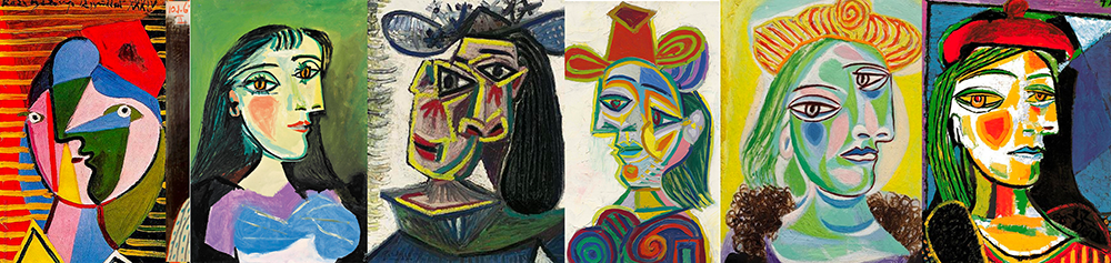
To be fair, many artists could fall into one or more of the above descriptions — Georges Braque, Robert Delaunay, Jacques Villon, Alice Bailly, Gino Severini, the chef d’ecole of Fauvism, Henri Matisse...
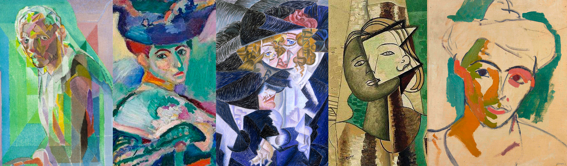
Many of Picasso's contemporaries also painted portraits featuring fractured figures and vibrant color schemes
Read an image like an art historian
In order to narrow down our choices, let’s take a step back and really describe what we’re seeing here. Get extra with the description — the more detailed, the easier it’ll be to determine the best match.
Looking at the photograph, a here’s what stood out to me:
- Gently rounded fields of color, generally devoid of crisp borders, evoking soft femininity.
- A bright, saturated palette, with a complementary color scheme.
- Hints of shading — if you look closely, the colors are not entirely a single shade.
- Fragmentation of the face with the peculiar eye and a single black accent to divide the left and right side of the face, an iconic nod to Cubism which rejected the single-angle perspective.
- The model is staring directly at the camera. This rapt fixation on the viewer demonstrates a woman with an intentional presence, rather than a candid moment with an unaware subject.
- The head dominates the space, with a single color background. The subject is occupying an ambiguous, anonymous setting.
- Lack of dramatic shadows — while the model is lit on the right side, the brilliant colors provide an illusion that appears to lighten her left. The effect is a softening of the shadow that otherwise would cause a starker contrast between the left and right side of her face.
For practiced art historians, this type of assessment takes only a few seconds as they scan through the image. While this description may seem like a lot to articulate, with practice, the ability to pick out important visual elements becomes quite automatic. Armed with pictorial vocabulary, it becomes easier to interpret and make appropriate connections. Colors, pose, shapes — yes those are the basics — and then you can look closely at things like technique, weight, the relationship between subject and viewer, mood, body language, symbolism and so on to determine the context.
Anyways, this description is plenty enough to start with. The displaced eye is a huge signal that this is a Cubist-inspired editorial, so we can disqualify Fauvism. The subject is not in motion, so it can't be a nod to the dynamic Italian Futurists. Picasso by far had the most saturated color palette, as opposed to the more muted hues of artists such as Georges Braque and Paul Klee. Cubists such as Jean Metzinger and Fernand Léger don't really have this aesthetic. Picasso is the most promising route to go down, but which work best illustrates this connection? Let’s go through a process of elimination.
Using color palette and form as a standard, we can confidently strike these periods out:
- The generally monochromatic Blue and Rose period (1901-1906)
- The angular, earth-toned figures influenced by African artifacts (1906-1909)
- The subdued hues of the Analytic period (1908-1912)
- The collaged compositions that characterized the Synthetic period (1912-1914)
- The more natural, neoclassical period (1919-1929)
- The grotesquely distorted, hard-edged portraits found in the likes of "Weeping Woman" as a reaction to the Spanish Civil War (1937)
That should narrow down candidates in his oeuvre considerably. Now that we’ve described the aesthetics of the photograph in question, we can use those as criteria to determine the level of best match.
We're looking for portraits that use a color-contour system, which uses colors as flat planes to indicate depth. We should avoid portraits with clearly outlined contours and angular fragmentation. While the colors may be similar, the feel is not the same. The photograph recalls a more rounded shape, a hint of biomorphism reminiscent of the likes of Joan Miro and Hans Arp.
Two extreme examples of angular fragmentation vs biomorphic forms.
I then compare a few works to see which one matches the best. Unless it's a fashion editorial that's imitating an artwork, there's usually no "correct" answer.
We have a few candidates that feature the divided head, the uneven eye, the colored planes. Many of them are of Dora Maar, Picasso's lover and muse. Maar was an artist herself, a photographer and painter who's works had largely been forgotten, her legacy overshadowed by her relationship with Picasso. In recent decades however, she's been receiving renewed interest. For those in Paris this summer, the Centre Pompidou is currently exhibiting the largest retrospective ever of Maar's work.
Getting down to the details
I placed the most promising artworks side-by-side with Okita's editorial, to see which one her work most closely resembled. Of the artworks I compared, I ultimately chose this yellow-dominated “Portrait of Dora Maar“ because of a few striking details:
The color palette is distinctly similar, even though the surface area doesn’t exactly match (most notably, "Dora Maar" lacks the sizable swath of orange). Here's a sample of colors that appear in both images:
Check out the strokes depicting the eye crease and eyebrow. The thin, sharp brow and the color of the eye crease are very similar, as well as the streak of teal at the top of the brow bone. Some of Picasso's portraits have fuzzier, stylized brows or don't include them at all.
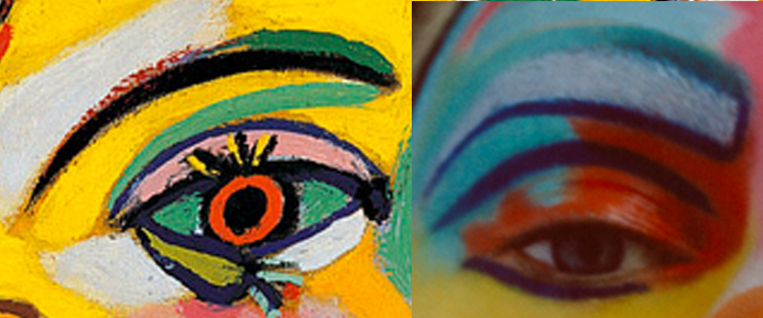
Both women have bright red-orange lips, emphasizing their femininity. There's also a distinct light blue shading between the nostrils and lips and a darker shade of blue/green beneath the lips in both images.
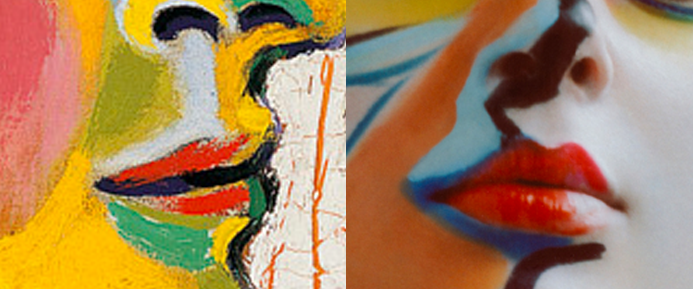
I had mentioned eye contact in the description earlier. This is very important. I wanted to match the confrontational, almost sultry look in the eyes. Although the "Dora Maar" painting I chose does not include a displaced eye and features prominent lashes, her irises are orange and icey-blue. Coincidentally, the model in Okita's photograph has those corresponding colors on her eyelids. Both portraits also outline the eyes in dark blue.
Though this instance of "Dora Maar" does not include a black stroke down the middle to bisect her head, the contour on the right hand side is a similar shape to the one that appears in the editorial. You can almost imagine the same black line if Dora Maar turned her head just so.
I ran through this comparison exercise with a few pieces. These are the types of minute characteristics I pay attention to when deciding the closest artwork. It's easy to throw up any Picasso work next to a Cubist-inspired fashion editorial and call it a day, but the exciting part of these matches is in the details. Perhaps these are just coincidences — or perhaps the deliberate choices that these artists make are more ingrained in our subconscious than we want to believe.
This is generally my process, trying to balance a number of influences and determining the one I feel is the most relevant — again, multiple influences may be apparent in a single image. This Picasso process was pretty straightforward — in the future, I'll walk through less obvious matches that uses coded cues that may not be accessible to the casual viewer. Revealing those stories has always been my favorite part of the art history practice. The pervasiveness of these visual codes in contemporary images fascinates me and I hope that my project sheds a light on how some of them weave through today.
Works referenced in this post:
- Girl with a Mandolin (Fanny Tellier) (1910)
- The Old Guitarist (1903)
- Pierrot (1918)
- Tête de Femme (Head of a Woman) (1962)
- The Acrobat (1930)
- Old Woman (Woman with Gloves) (1901)
- Le Rêve (1932)
- Fernande with a Black Mantilla (1905)
- Nu assis s'essuyant le pied (Seated Nude Drying her Foot) (1921)
- Les Demoiselles d'Avignon (1907)
- Head of a man with hat (1912)
- Buste de femme (Dora Maar) (1940)
- Woman with a Hat (Olga) (1935)
- Self-Portrait with Palette (1906)
- Child with a Shovel (1971)
- The Actor (1904-1905)
- Self portrait, by Jacques Villon (1942)
- Woman with a Hat, by Henri Matisse (1905)
- Portrait of Madame M.S., by Gino Severini (1913-1915)
- Portrait of a woman, by Georges Braque (1930)
- Portrait d’Ida Chagall, by Henri Matisse (1948)
- Femme au béret et à la robe quadrillée (Marie-Thérèse Walter) (1937)
- Reading (1932)
- Woman turned right (1934)
- Buste de femme (1937)
- Tête de femme. Dora Maar (1941)
- Buste de femme (Dora Maar) (1938)
- Bust of a Woman (Dora Maar) (1938)
- Femme au béret rouge (1937)